
In a recent column, Tim Harford said:
“For most of us, the scarce resources in this information war aren’t years of study or intellectual brilliance. They are softer assets: curiosity, patience, persistence and judgment. It is not too late to bring them to the battle.”
While this claim might seem simplistic, I believe that there is something fundamental in it. Sure, debunking certain claims is time consuming and require skills that we might not have, especially when the claims are made with data. Often, however, even limited amount of poking can help us assess the robustness of claims we are exposed to on social media or offline.
Many false claims crumble quickly under scrutiny, but we are too quick to accept what we are told as the truth. We also fool ourselves because we are trained to see patterns where there aren’t any. Many people know the saying “correlation is not causation”, yet many of us fall for flimsy claims that there is a causal link between two measures because they correlate.
A particularly effective way of making us jump to conclusions is to show us data about two measures over time with two different y-axes for each time series (this tweet is an example, here is why I think it is not very convincing).
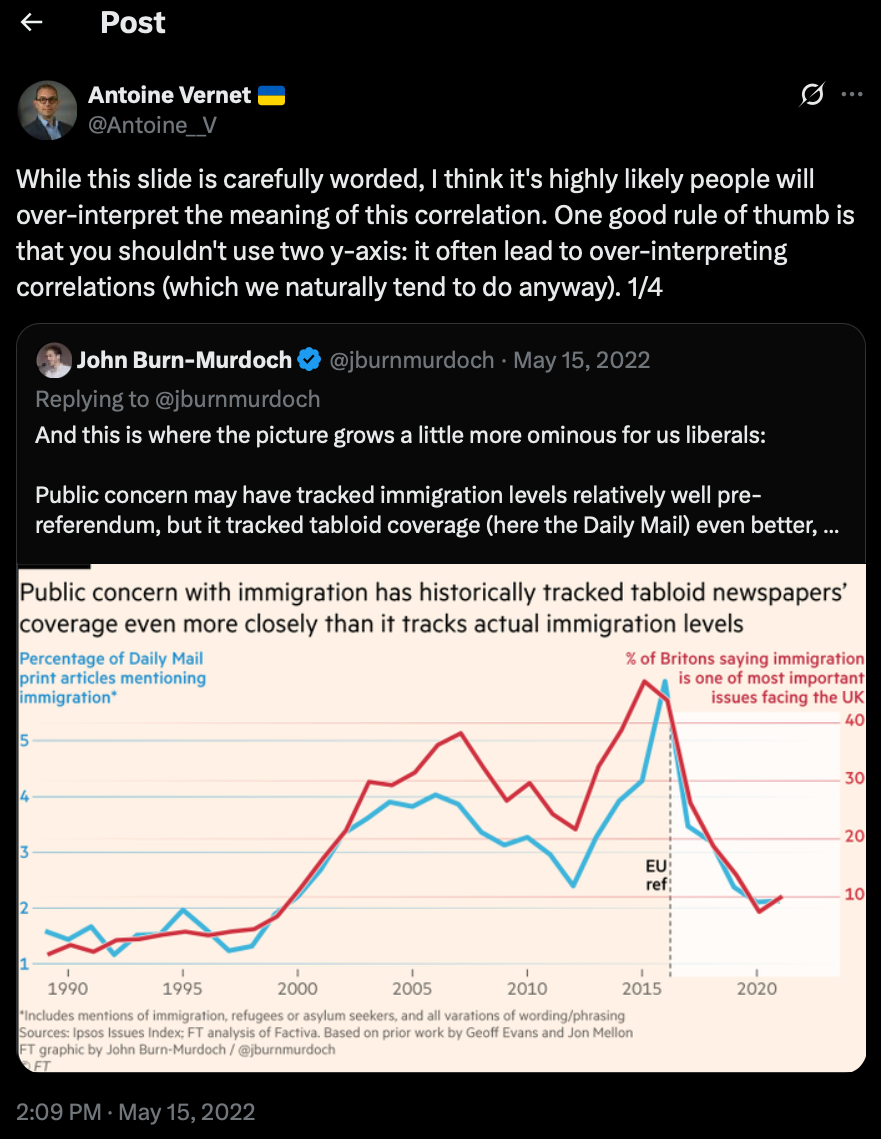
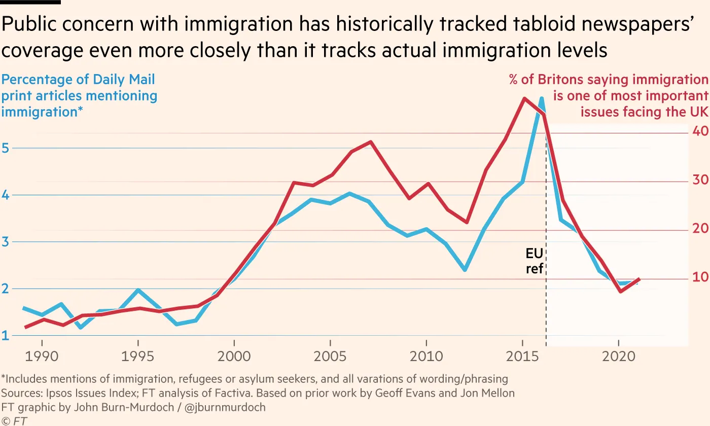
Changing the scale of one of the y-axes allows to increase the impression that the two time series coevolve, our ability to see patterns when there is none does the rest.
In summary, be very careful when you are presented with a graph that has two y-axes. Don’t believe me? Go have a look at Tyler Vigen’s always hilarious site: spurious correlations.
Citation
@online{vernet2022,
  author = {Vernet, Antoine},
  title = {One Simple Tip to Avoid Falling for Fake News and Bullshit},
  date = {2022-05-20},
  url = {https://antoinevernet.com/blog/2022/05/bullshit/},
  doi = {10.59350/tzgwv-wag86},
  langid = {en}
}