---
title: "Do Universities Really Take Excessive Financial Risks?"
date: 2026-04-15
description: "I am not mad, please do not put in the paper that I was mad."
image: "img/fig1.png"
twitter-card:
image: "img/fig1.png"
open-graph:
image: "img/fig1.png"
categories:
- social science
- UKHE
- open data
resources:
- "img/*"
doi: "10.59350/m9wh0-nqz40"
citation: true
freeze: true
---
On april 9th 2026, _The Guardian_ published an article titled ["'Excessive' financial risks threaten survival of many English universities, report warns."](https://www.theguardian.com/education/2026/apr/09/english-universities-excessive-financial-risks-survival-warns-thinktank)
This follows the publication of a report by the Higher Education Policy Institute (HEPI) titled ["A degree of regulation: Building a more financially sustainable and resilient higher education sector"](https://www.hepi.ac.uk/reports/a-degree-of-regulation-building-a-more-financially-sustainable-and-resilient-higher-education-sector/).
In typical _Guardian_ fashion, they did not include the link to the report in their article, so: you're welcome! I have included it above.
The article included two graphs. I am attempting to remake both of them using the publicly available HESA data.
I am hoping that I will be able to reproduce these two graphs, so then I can go on criticising one of them that I think is misleading.
Both graphs come from the report, but the article makes no mention of that (they have been restyled to fit the guardian style).
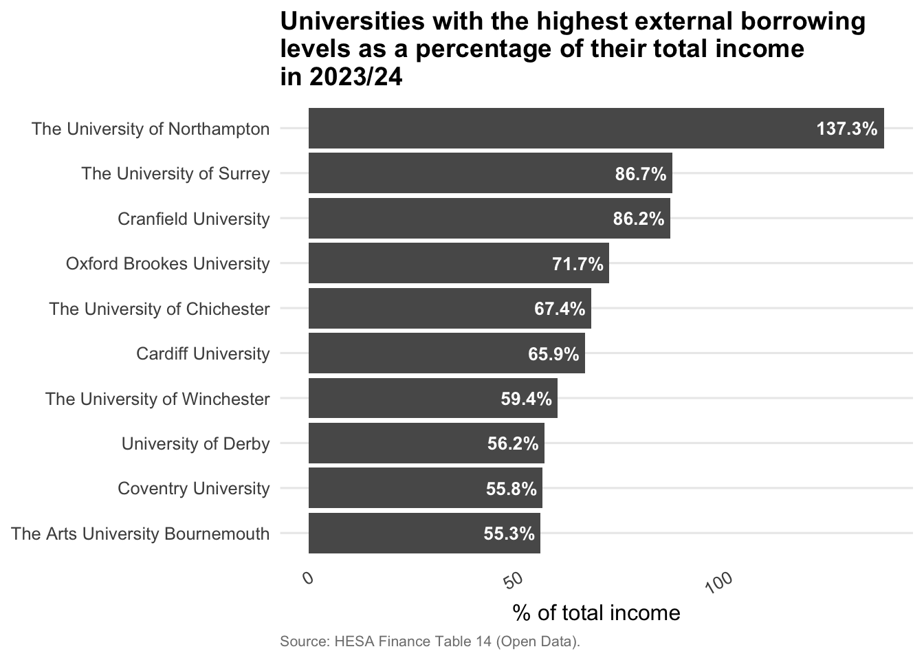
# External borrowing
The first graph looks at external borrowing levels as a percentage of income.
```{r}
#| label: setup
#| message: false
#| warning: false
#| echo: false
library(dplyr)
library(ggplot2)
library(ggrepel)
library(scales)
library(tidyr)
extB <- read.csv("data/extB.csv")
fte <- read.csv("data/fte.csv")
```
```{r}
#| label: Figure3
#| echo: false
focus_providers <- c(
"The University of Northampton",
"The University of Surrey",
"Cranfield University",
"Oxford Brookes University",
"The University of Chichester",
"Cardiff University",
"The University of Winchester",
"University of Derby",
"Coventry University",
"The Arts University Bournemouth"
)
focus <- extB |>
filter(he_provider %in% focus_providers)
ggplot(focus, aes(x = value, y = reorder(he_provider, value))) +
geom_bar(stat = "identity") +
geom_text(aes(label = paste0(round(value, 1), "%")),
hjust = 1.1, colour = "white", size = 3.5, fontface = "bold") +
labs(
title = "Universities with the highest external borrowing\nlevels as a percentage of their total income\nin 2023/24",
caption = "Source: HESA Finance Table 14 (Open Data).",
x = "% of total income",
y = NULL
) +
theme_minimal(base_size = 12) +
theme(
plot.title = element_text(face = "bold", size = 14),
plot.subtitle = element_text(colour = "grey40", size = 10),
plot.caption = element_text(colour = "grey50", size = 8, hjust = 0),
axis.text.x = element_text(angle = 30, hjust = 1),
panel.grid.minor = element_blank(),
panel.grid.major.x = element_blank()
)
```
Good news, it looks like my open data from HESA matches with the data used to make the graphs in the report as this reproduces exactly[^1]
[^1]: My data is not exactly the same, I seem to have a more recent release of the data (I downloaded it on the 8th of April), but it mostly matches the data used in the report.
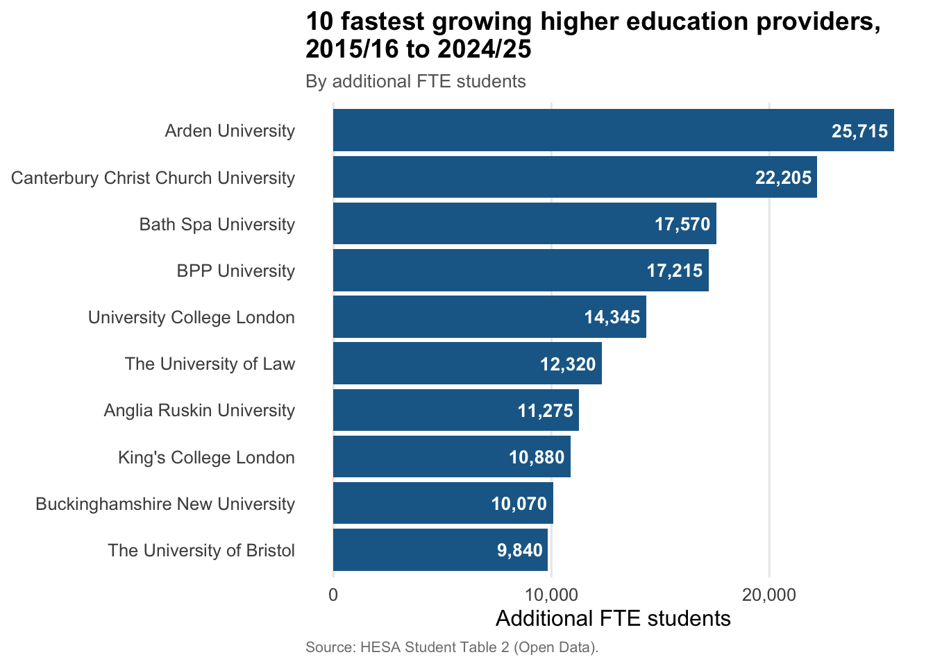
# Student growth
Now to remake the second graph.
```{r}
#| label: Figure1
#| message: false
#| warning: false
#| echo: false
fte_wide <- fte |>
pivot_wider(names_from = academic_year, values_from = number) |>
rename(fte_2015 = `2015/16`, fte_2024 = `2024/25`) |>
filter(!is.na(fte_2015), !is.na(fte_2024)) |>
mutate(abs_growth = fte_2024 - fte_2015)
top10_abs <- fte_wide |>
slice_max(abs_growth, n = 10)
fig1 <- ggplot(top10_abs, aes(x = abs_growth, y = reorder(he_provider, abs_growth))) +
geom_bar(stat = "identity", fill = "#1d6996") +
geom_text(aes(label = scales::comma(round(abs_growth))),
hjust = 1.1, colour = "white", size = 3.5, fontface = "bold") +
labs(
title = "10 fastest growing higher education providers,\n2015/16 to 2024/25",
subtitle = "By additional FTE students",
caption = "Source: HESA Student Table 2 (Open Data).",
x = "Additional FTE students",
y = NULL
) +
scale_x_continuous(labels = scales::comma) +
theme_minimal(base_size = 12) +
theme(
plot.title = element_text(face = "bold", size = 14),
plot.subtitle = element_text(colour = "grey40", size = 10),
plot.caption = element_text(colour = "grey50", size = 8, hjust = 0),
panel.grid.minor = element_blank(),
panel.grid.major.y = element_blank()
)
ggsave(
"img/fig1.png", fig1,
width = 8, height = 4, dpi = 300
)
```
Again, I am able to reproduce the graph from the report[^almost].
[^almost]: There is a couple of differences in terms of the institutions appearing. My guess is that my data is more recent than the one used in the report, and some institutions that had not reported data for the last year have now done so.
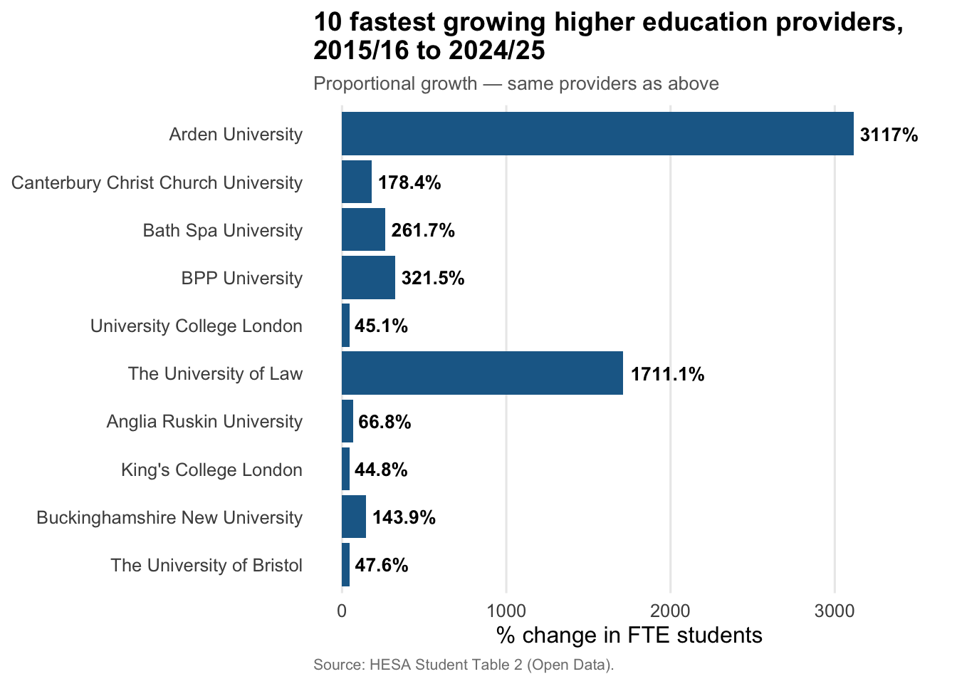
To address the differences in the institutions that are represented in my graph, I redo the graph selecting the same institutions as in the report below.
```{r}
#| label: Figure1_report
#| message: false
#| warning: false
#| echo: false
top10_report <- fte_wide |>
filter(he_provider %in% c(
"Arden University",
"Canterbury Christ Church University",
"Bath Spa University",
"BPP University",
"University College London",
"The University of Law",
"Anglia Ruskin University",
"King's College London",
"University of Manchester",
"Buckinghamshire New University",
"The University of Bristol"
)) |>
arrange(abs_growth)
ggplot(top10_report, aes(x = abs_growth, y = reorder(he_provider, abs_growth))) +
geom_bar(stat = "identity", fill = "#1d6996") +
geom_text(aes(label = scales::comma(round(abs_growth))),
hjust = 1.1, colour = "white", size = 3.5, fontface = "bold") +
labs(
title = "10 fastest growing higher education providers,\n2015/16 to 2024/25",
subtitle = "By additional FTE students",
caption = "Source: HESA Student Table 2 (Open Data).",
x = "Additional FTE students",
y = NULL
) +
scale_x_continuous(labels = scales::comma) +
theme_minimal(base_size = 12) +
theme(
plot.title = element_text(face = "bold", size = 14),
plot.subtitle = element_text(colour = "grey40", size = 10),
plot.caption = element_text(colour = "grey50", size = 8, hjust = 0),
panel.grid.minor = element_blank(),
panel.grid.major.y = element_blank()
)
```
This reassures me that my data is correct as I am able to replicate the graph from the report exactly.
Now for the criticism: I think this graph is misleading!
Why?
Because it is used to suggest that these institutions are growing too fast.
But this table shows only the growth in FTE[^2] students, not the proportion of students. This seems an odd choice if you are trying to argue that some providers are growing too fast.
Surely, in this case, you want to look at growth rate, not just number of students.
[^2]: Full Time Equivalent.
Ok, let's now make a graph that really looks at growth rates of the student population.
This will tell us if institutions are indeed growing too fast.
```{r}
#| label: Figure1_redux
#| message: false
#| warning: false
#| echo: false
top10_report_pct <- top10_report |>
mutate(pct_growth = (fte_2024 - fte_2015) / fte_2015 * 100)
ggplot(top10_report_pct, aes(x = pct_growth, y = reorder(he_provider, abs_growth))) +
geom_bar(stat = "identity", fill = "#1d6996") +
geom_text(aes(label = paste0(round(pct_growth, 1), "%")),
hjust = -0.1, colour = "black", size = 3.5, fontface = "bold") +
labs(
title = "10 fastest growing higher education providers,\n2015/16 to 2024/25",
subtitle = "Proportional growth — same providers as above",
caption = "Source: HESA Student Table 2 (Open Data).",
x = "% change in FTE students",
y = NULL
) +
scale_x_continuous(labels = function(x) paste0(x, "%")) +
xlim(0, 3500) +
theme_minimal(base_size = 12) +
theme(
plot.title = element_text(face = "bold", size = 14),
plot.subtitle = element_text(colour = "grey40", size = 10),
plot.caption = element_text(colour = "grey50", size = 8, hjust = 0),
panel.grid.minor = element_blank(),
panel.grid.major.y = element_blank()
)
```
This looks like I expected, the large well-known providers are growing at a much more reasonable pace, than less well-known, newer providers.
Indeed, the expected pattern arises: UCL, King's College, and the University of Bristol are growing at an average yearly rate of, respectively, `r round((1.451^(1/9) - 1) * 100, 2)`%, `r round((1.448^(1/9) - 1) * 100, 2)`, and `r round((1.476^(1/9) - 1) * 100, 2)` percent.
Hardly a breakneck pace!
So yes, unsurprisingly, when you want to understand growth, the initial size of the provider matters a lot.
Looking at raw change in number of students hides the fact that large providers will add more students than smaller providers while growing at the same or a lower pace.
This plot now highlights that Arden and The University of Law are not really like the other providers on this list.
And sure, they are different in more ways than one as both are private for-profit providers.
BPP is the only other private for-profit provider in this list.
Unsurprisingly, it is the third fastest growing provider.
It is almost as if the fastest growing providers are not what people think about when they think about universities, as they are all relatively recent private providers.
Again, this feel too much like the usual bad faith argument that Universities are behaving badly based on the fact that a small number of private providers are.
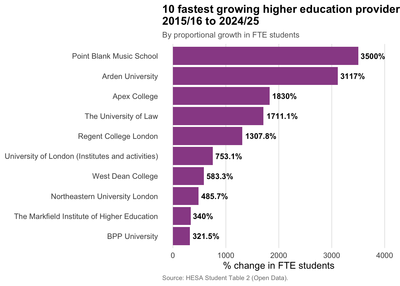
# Who grows fastest
What if we instead look at the 10 providers that grew the fastest in proportional terms?
The list may well be different: smaller providers that doubled or tripled in size would show up, while they do not when looking at raw numbers.
```{r}
#| label: Figure1_redux2
#| message: false
#| warning: false
#| echo: false
top10_pct <- fte_wide |>
mutate(pct_growth = (fte_2024 - fte_2015) / fte_2015 * 100) |>
slice_max(pct_growth, n = 10)
ggplot(top10_pct, aes(x = pct_growth, y = reorder(he_provider, pct_growth))) +
geom_bar(stat = "identity", fill = "#994e95") +
geom_text(aes(label = paste0(round(pct_growth, 1), "%")),
hjust = -0.1, colour = "black", size = 3.5, fontface = "bold") +
labs(
title = "10 fastest growing higher education providers,\n2015/16 to 2024/25",
subtitle = "By proportional growth in FTE students",
caption = "Source: HESA Student Table 2 (Open Data).",
x = "% change in FTE students",
y = NULL
) +
scale_x_continuous(labels = function(x) paste0(x, "%")) +
xlim(0, 4000) +
theme_minimal(base_size = 12) +
theme(
plot.title = element_text(face = "bold", size = 14),
plot.subtitle = element_text(colour = "grey40", size = 10),
plot.caption = element_text(colour = "grey50", size = 8, hjust = 0),
panel.grid.minor = element_blank(),
panel.grid.major.y = element_blank()
)
```
Only Arden, The University of Law, and BPP University show up in both lists.
Most of these providers are relatively small, and are private (the only non private ones are the University of London, West Dean College, and Markfield Institute of Higher Education).
# In conclusion
Sure, the government should crack down on bad behaviour by HE providers, but it is usually not traditional universities that are bad actors.
The government should, instead, properly fund and defend universities as they are one of the engine of growth in the country, through both education and research.
Once I have read the full report, I might write another post, if there is more to say about it.